Tote Bag
Product Design
2019
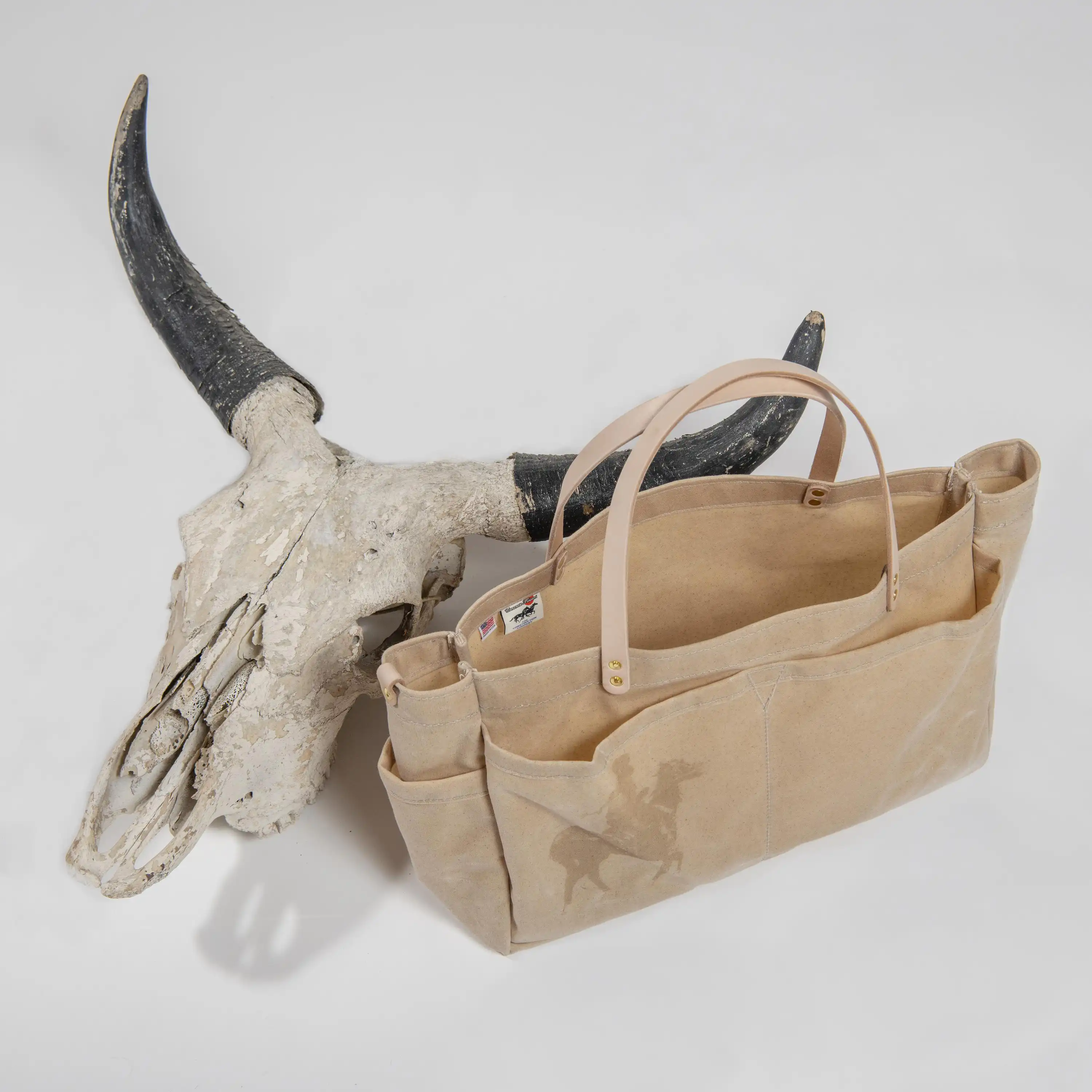
The making of this product stemmed from the aspiration to craft a durable tote designed for lifelong use. Extensive research served as the driving force in shaping the design, involving the deconstruction of various bags to inform how other beloved bags are made. The commitment to ruggedness influenced the crucial selection of materials, with the bag utilizing 18oz Duck Martexin Original Wax Plain Wave sourced from Fairfield Textile, a fabric with a storied history dating back to 1930. The inclusion of vegetable-tanned leather handles, riveted for sustainable support, adds to the bag's durability. Thoughtful details, such as a d-ring with an antique brass screw lock clip, large exterior pockets, and brass accents, contribute to the overall cohesion of the design. Manufactured in southeast Ohio by local craftsmen, this close collaboration ensures quality control and the delivery of a high-quality end product.
In the end, this tote bag can hold at least a couple of gallons of water with minimal leakage due to its seam construction, and it can also accommodate spare engine parts from a Honda XR650L, along with the tools needed for assembly. The bag can also hold all your things for when you go to the beach. Although it is thoroughly reinforced, if anything fails, you can repair it yourself or seek assistance from a local cobbler or boat tarp sewer. Nonetheless, it is a simple product that has a purpose that starts and ends with a new story.
Pail Blue
Graphic Identity
2023

Pail Blue, a versatile design studio, offers a range of services including architecture, spatial design, graphic and visual design, and product design. The studio's core letter marks focus on the strategic integration of "P" and "B," establishing a distinct and consistent brand identity that radiates diverse styles rooted in historical references. In addition to letter marks, Pail Blue employs image-based logo marks inspired by flowers and Japanese style drawn birds, showcasing the studio's range of inspirations. The studio incorporates three typefaces Halyard for headings, PT Sans for body text, and Utopia, a serif face, for extensive text projects. Pail Blue's color palette features navy for legibility, complemented by brown and accents of baby blue with a minimalist approach limiting each application to a maximum of three colors. The identity's meticulous framework informs real-life design decisions across various platforms, maintaining visual cohesion and effectiveness. Iconography and strategically placed logos enhance brand recall, exemplifying Pail Blue's adaptability and functionality in diverse contexts.
Midpractice
Graphic Identity
2023
Colton Campbell leads Midpractice, an editorial project exploring film and art through a mix of traditional and modern mediums. The project's logo marks undergo purposeful evolution, blending Swiss design and 16th-century woodblock influences. Midpractice's visual identity incorporates a single color palette that changes with each season, using Neue Haas Unica for headings and Franklin Gothic for body text. Pail Blue helped design the website, which follows modern design principles with a minimalist, brutalist approach, focusing on core functions rather than ornamentation. Pail Blue also produced Midpractice's inaugural book, using the Risograph print method, complemented by a creatively directed photoshoot for a cohesive book launch. The book was independently published and distributed.
Midpractice is the ongoing passion project for Colton Campbell, who hails from a small town in southeast Ohio with a population of less than 3000 people. Colton now resides in Chicago, where he manages the famous Music Box Theatre, works as a substitute teacher, dabbles in woodworking, and pursues writing.
Cantina
Graphic Identity
2022
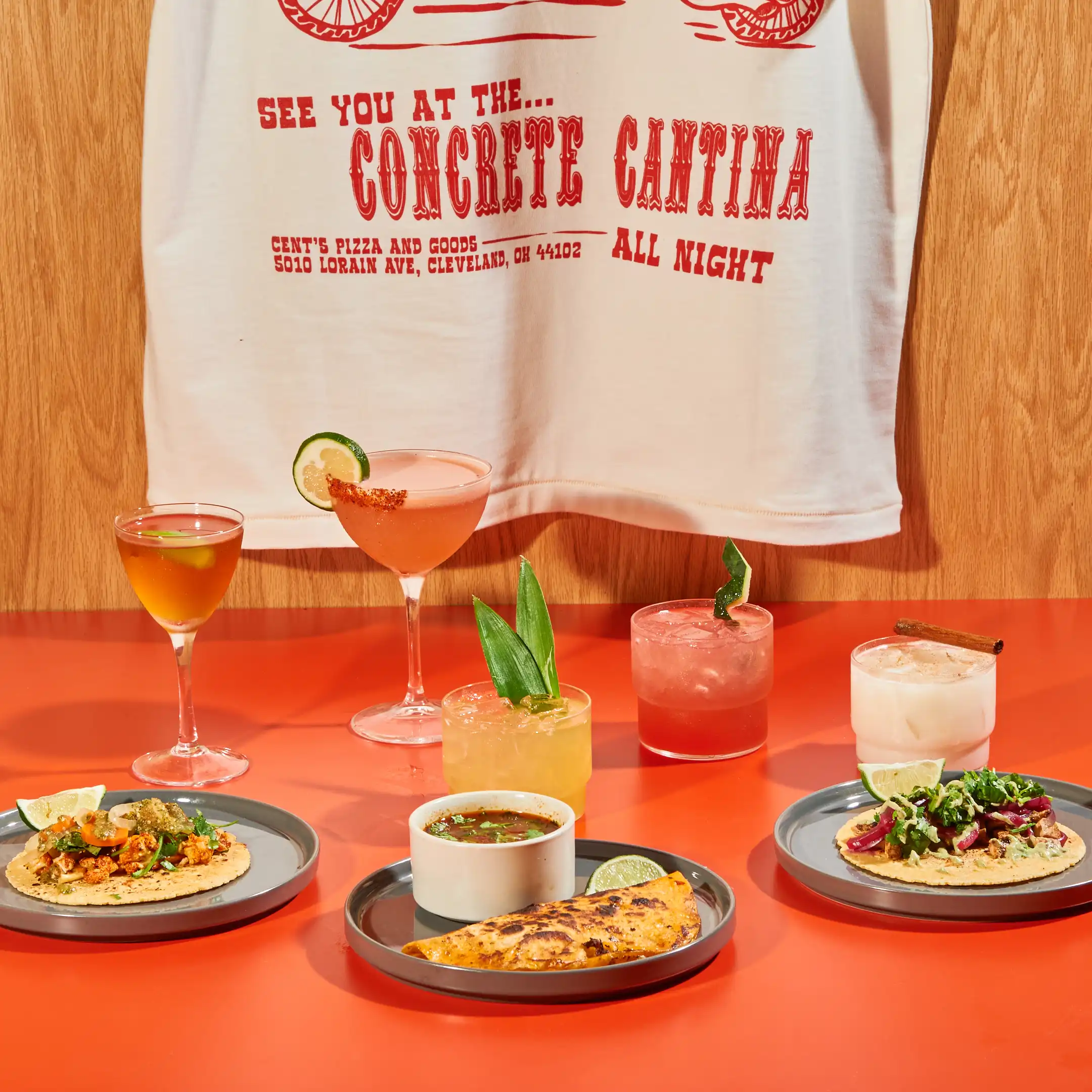
This event was a collaboration between Concrete Flowers and Pail Blue for the Concrete Cantina, a one-night food pop-up. Pail Blue's focus was on design elements and the overall graphic identity, while Concrete Flowers contributed their culinary vision and expertise, resulting in a distinctive experience. The food at Concrete Cantina was emphasized by efficiency and enjoyment in its quick-service menu, complemented by a creatively crafted beverage menu. The overall narrative drew references from the American Frontier and debauchery.
The project employed expressive typefaces (Boncegro and QuentinCaps) and a vibrant three-color palette. Photographs captured at the pop-up venue, influenced by fill flash fashion photography, provided an immersive experience through strong contrasts in shadows.
During the event, Pail Blue’s efforts in establishing a graphic identity were also supported by a special edition t-shirt cut and sewn in Spain, drawing inspiration from beloved shirts from the 1990s. The pattern was designed by referencing 17 shirts sent to manufacturers in Canet, Spain. These manufacturers have partnered with cotton farmers who are able to produce a fabric that is 10oz/yd."
Incense Chamber
Product Design
2019
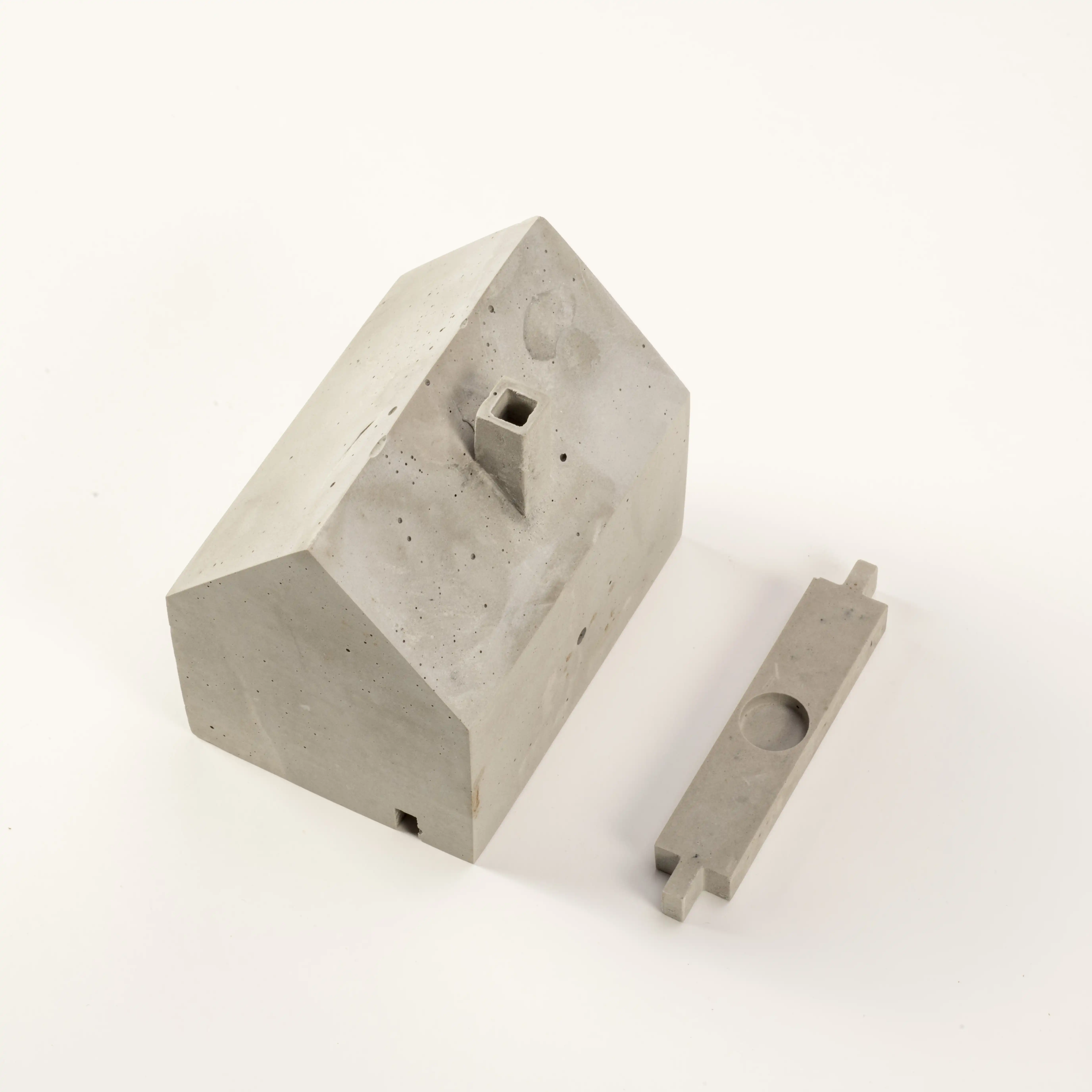
The Incense Chamber takes after the form of a Dutch barn-style house, incorporating the characteristic proportions of the pitched roof, offset chimney, and simple facade following its structure. Constructed from a blend of anchoring cement and fiberglass reinforcement, the chamber ensures robust structural integrity. Its functionality is straightforward: users place incense on the platform, light it with the provided matches, and position the house on top. As the aromatic smoke ascends, it travels through the chimney, creating a tranquil and relaxing ambiance wherever it's placed. In the end, the incense chamber itself is frivolous and makes people smile. At first glance, it looks simple, but after many physical iterations and failures in proper ventilation, the incense smoke finally comes through the chimney at a calming rate. This product is part meditation as much as it is part of emitting aromatic smoke.
Another significant aspect of this product is the packaging in which the incense chamber is housed. It resides in a simple dovetail wooden box made from hobby wood, readily available at any craft store. The compression of the joints makes it hardware-free and allows for easy disassembly to be flat-packed. The idea behind this was to repurpose the packaging as another object. It can hold pencils, coins, or perhaps various matchboxes collected from restaurants and bars around the world.
Ladder 4
Graphic Identity
2023
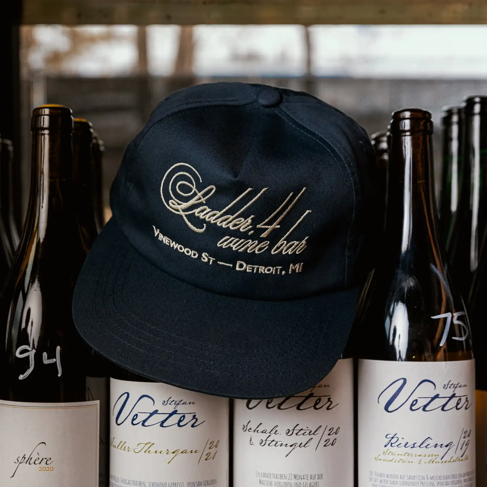
Ladder 4 Wine Bar collaborated with Pail Blue for the design of a limited merch collection. Rooted in precedent research, particularly drawing inspiration from early 20th-century design, the project focused on French calling cards as a source of inspiration and then implemented the use of expressive type design. The final typographic work includes a script that evokes handwritten elegance with exaggerated strokes. The resulting designs, embroidered onto a hat, hooded sweatshirt, and featured on matchbooks serving as unique business cards, reflect the essence of the bar's sophisticated aesthetic.
Ladder 4 is a wine bar located in Detroit, Michigan, housed in a restored firehouse from where it gets its name. Ladder 4 is constantly exploring the intersection of food and beverage. Menus change daily in aneffort to support sustainable purchasing of produce, meat, and wine from smaller producers based on their seasonal-based offerings. The staff maintains an attitude of providing an approachable atmosphere to showing that our tastes in food and beverage is a universal language that binds us all together.